
A product has been added to the basket
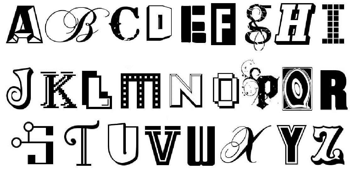
What's in a font?
What's in a font?
Have you ever wondered what your choice of font says about your personality? Much like handwriting, good typography can really make or break a message, with ones preference reflecting not only their personality, but also their attitude and even job type. Vital for giving off the right impression, whether you wish to project a business persona on your CV, or sharp and sophisticated appearance on an invitation, it’s important to ensure your chosen font emulates the essence of what you want to say. With so many typefaces to choose from it can be confusing, so to help you decipher your Cambria from your Comic Sans, Pen Heaven have whittled down the top font choices, detailing the perfect use of occasion and what they reveal about the author. 
Arial The quick brown fox jumps over the lazy dog
Once the first pick for the masses, this font is plain and simple, dominated by straight lines. Great for a user unsure of their audience requiring a clean, no fuss font. The pick of conformists the world over.
Cambria The quick brown fox jumps over the lazy dog
A newcomer to the font world and a popular default choice. This font draws on classic font styles like Times New Roman for its design, but gives a modern twist with a pronounced line variance between the curves and straight lines. It has a professional edge with a unique twist, perfect for office bods with a sense of style.
Comic Sans The quick brown fox jumps over the lazy dog
No longer cool and definitely not one to use on your CV, this font is the joker in the pack. Rounded edges and jaunty lines give this font a definitively off-piste feel. Perfect for children or for comedic value.
Curlz The quick brown fox jumps over the lazy dog
Overused when it was first released, this font is used by those who try too hard. It has just about every feature you can think of; curlicues, serifs, line variation, inconsistent writing angle and irregular sized lettering. Bit much?!
Franklin Gothic The quick brown fox jumps over the lazy dog
A reputable font which shows class and sophistication, the user of this typeface is considered trustworthy and loyal. Whilst quite plain and simple, this font has quirky touches like a bold finish and the retro typewriter style lower case g. 
Futura The quick brown fox jumps over the lazy dog
An old favourite with design folk, if not a little overused, this typeface exudes Bauhaus style and utilises straight lines and symmetrical lettering (where possible). One for those with exacting taste.
Helvetica The quick brown fox jumps over the lazy dog
A top pick for design enthusiasts and art lovers, this font says "I have my life together". This font mixes classic styled fonts like Times New Roman with the modern feel of Futura. A perfectionist’s choice.
Lucida Calligraphy The quick brown fox jumps over the lazy dog
Perfect for posh invitations and well-loved back in the 90's, this font is still holding strong today. The mix of handwritten style with a legible print format, ensures readability for young and old alike, and adds to the popularity. The typeface is the quirky choice for the older generation and personalised stationery.
Rockwell The quick brown fox jumps over the lazy dog
Well, quite simply because users of this love rock! Bold straight lines finished with perfectly rounded curves, give this typeface a classy feel with a hint of edginess. Rock on! 
Times New Roman The quick brown fox jumps over the lazy dog
You are a traditionalist through and through and are likely to be averse to change. Perfect for communicating anything business related.
Verdana The quick brown fox jumps over the lazy dog
Perhaps the dullest font in our selection, using this may well send your reader asleep with its monotonous characters. Very similar to the simple characteristics of Arial, but with larger letters and more pronounced letter spacing.

Rollerball vs. Ballpoint Pens: A comparison July 17, 2013

Refill Guide September 2, 2015

Fountain Pen Nib Width Comparison August 4, 2015

Lead Sizes for Mechanical Pencils October 19, 2015
Egg-straordinary Stationery March 21, 2024
LAMY safari's Spring Awakening April 26, 2023
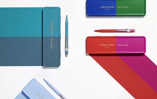
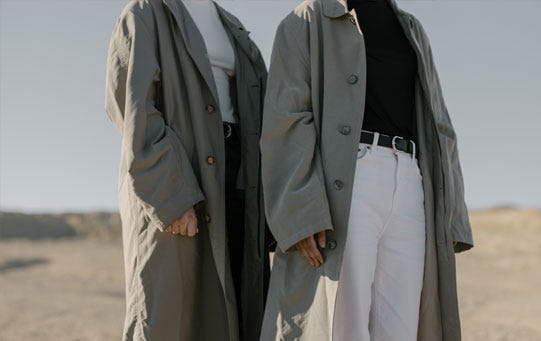
Flair for Fashion March 8, 2023
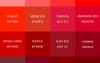
Shades of Red January 31, 2023
Comments